Cases
Online store for «Autentica Aroma» for skin care cosmetics
Craft online store of niche cosmetics
2023
Address:
autenticaroma.comthe site

Autentica Aroma is a cosmetics brand whose philosophy is designated as «A line of holistic skin care, created to awaken the highest potential of the skin and maintain its long–term health and radiance»
The company's products are based on only natural ingredients and there are no synthetic compounds. The goal of Autentica products is to «give the skin an impulse for self–healing and regeneration.»
As a team, we fully share these
The company's products are based on only natural ingredients and there are no synthetic compounds. The goal of Autentica products is to «give the skin an impulse for self–healing and regeneration.»
As a team, we fully share these
The task set
by the customer
To develop an online store for the sale of brand care cosmetics
Project summary
The beginning of work:
september 2023
Completion of work:
march 2024
What tasks did we solve
in the project «Autentica Aroma»
What tools
did we use
For design – traditional Figma.
Word for reporting
Word for reporting

Figma

Nuxt.js

HTML

MS Word

CSS

Vue.js
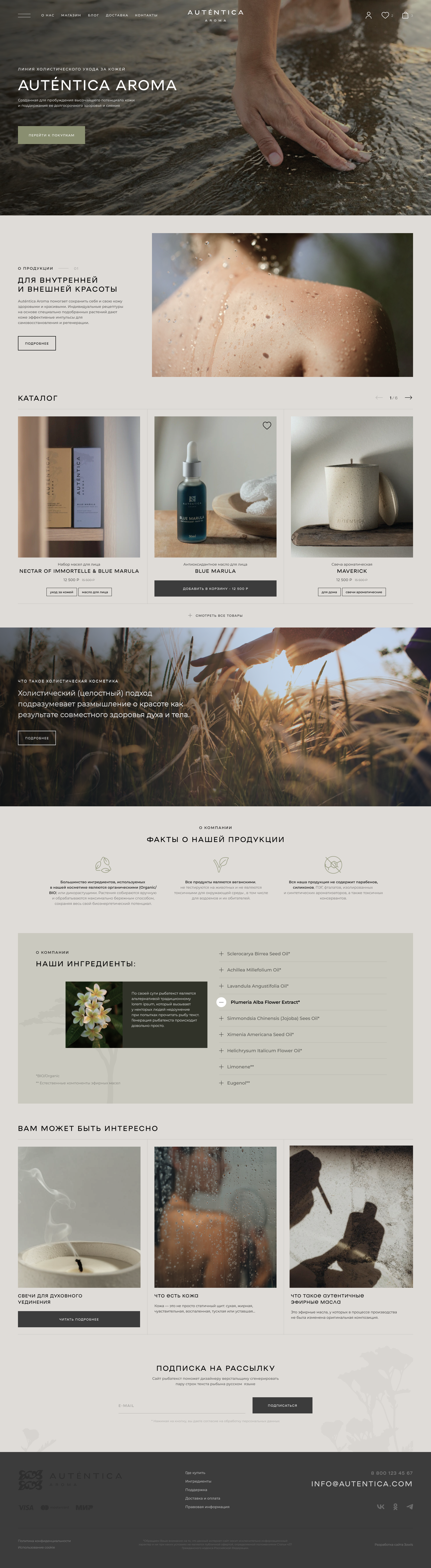
We have worked out the structure of the main page
The main page was developed by the customer: it reflects and describes the philosophy of the brand, which is indicated in the name – the company focuses on naturalness, authenticity, and holistic. and the page has planned a special interface for getting to know the ingredients that are used in Autentica cos.

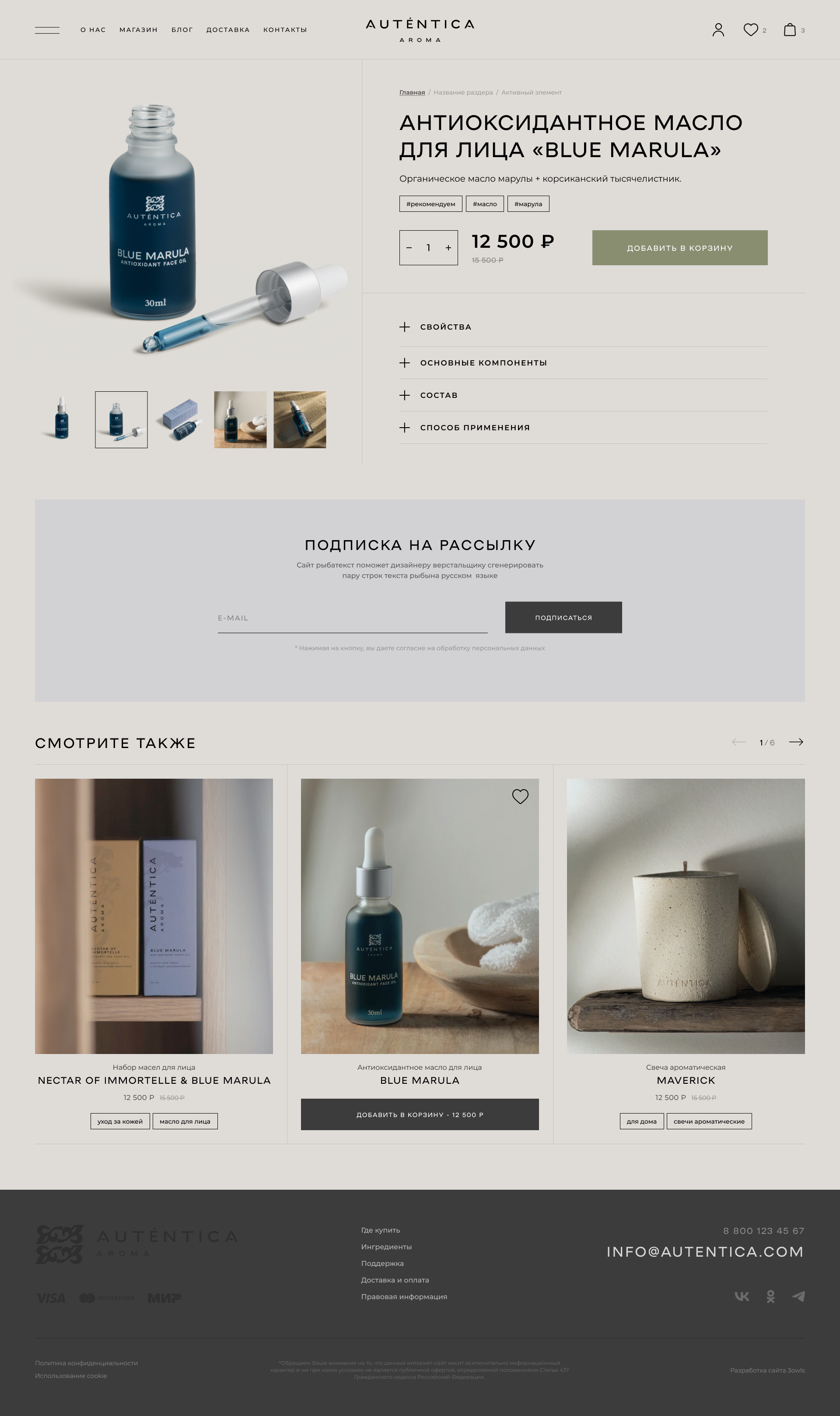
We designed the product card
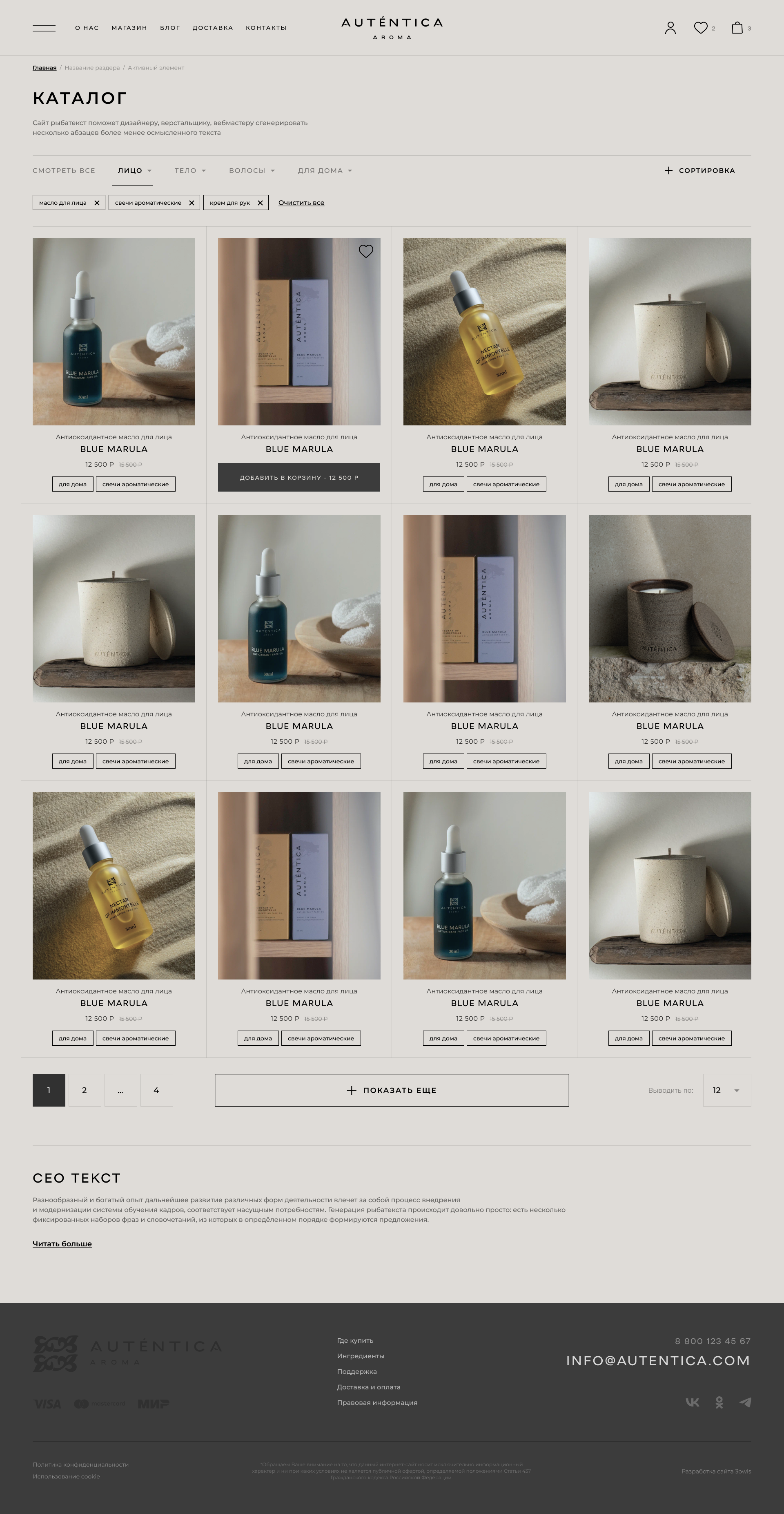
A product catalog and product cards were made in the goods section. In the catalog, in addition to the cost and type of product, it was proposed to make segmentation according to the purpose of the product.
We decided to show several main sections with information in the product card, including properties, main components with a detailed description, full composition and method of application.
We decided to show several main sections with information in the product card, including properties, main components with a detailed description, full composition and method of application.
Look at the product card:
Watch more

We have developed a design style
The overall style is made in pastel colors with low contrast. This is necessary to highlight the blocks with photo content in the design, and emphasize the visual concept of the brand.

We made a layout
The site layout was rendered in Figma. For coordination, not only the pages were drawn, but also their different states (with modal windows and open accordions), as well as user scenarios (authorization and registration, adding
goods to the cart
goods to the cart
Watch more layouts in Figma:
Watch more

We have selected a visualization
The owners of the company had very high requirements for photographic materialsrials on the site, and their vision did not match ours. Out of habit, we collected photos with people and faces, based on research (verified by personal practice) that a face and gaze into the lens significantly increase the effectiveness of advertisirials.
The customer saw it differently, and asked to use nature and photography not with eyes, but with skin as subjects. It took 4 iterations to select stock photos that were «relatively consistent with expectations». But we did it) We agreed that after the launch we will do a separate photo shoot to create perfect photos, and for the first time we will work on stock ones.

Landing page
We have set up a website
and made a Frontend application
and made a Frontend application
Traditionally, the layout was done using the BEM approach and using rem units for scaling. Frontend was implemented on Nuxt (vue.js v.3), some of the interfaces were kept static on a single frontend – management is easier to implement through small technical support tasks.
The site is located on an unusual hosting for us reg.ru – the customer chose him. Once again, we were convinced of the correctness of choosing other hosting providers :)
Watch more layouts in Figma:
Watch more

Shopping cart and check-out
Shopping cart and checkout are designed in accordance with the latest trends. The whole scenario is implemented in a modal window, which occupies ¼- 1/3 of the screen, and is located
on the right side. To return to purchases, simply close the modal window.
on the right side. To return to purchases, simply close the modal window.
There are 3 steps in placing an order:
1. Data entry, contains 3 fields, all fields are required: name, phone, e-mail.
2. The method of receipt. There are 2 options available: delivery by mail or courier. Contains fields for enter entering the address.
3. Choosing a payment method: upon receipt either online.
When choosing a payment method, the Online site redirects tgateway.
2. The method of receipt. There are 2 options available: delivery by mail or courier. Contains fields for enter entering the address.
3. Choosing a payment method: upon receipt either online.
When choosing a payment method, the Online site redirects tgateway.

We came up with hints
Not all users know what useful properties a particular plant has. For the convenience of customers we have made a mini-encyclopedia with hints when hovering / tapping on the name name: the names on the site are given in Latin, translations and descriptions of useful properties are given in the too.
Additionally, we made a summary page with all the ingredients of cosmetics.

Landing pages
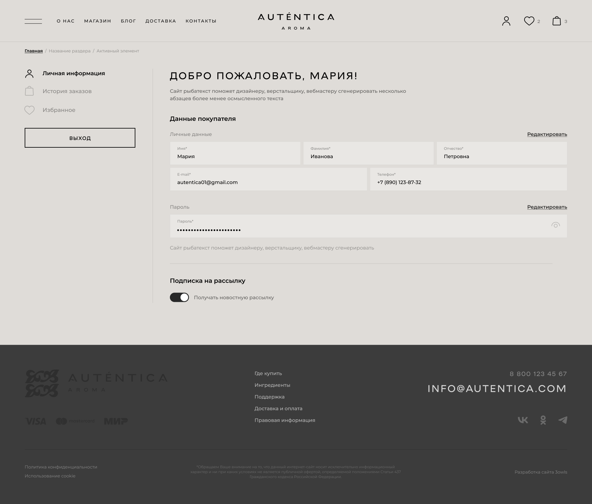
User's personal account
We have provided the possibility of user registration and advanced functionality for registered users. The registration and authorization scenario was also designed in modal windows.
Available in your personal account:
- Personal information with the possibility of editing and updating it, changing the password
- Order history. The story is implemented as a single page, the details are hidden in an accordion. When viewing detailed information, the payment type, cost, and order status are available: issued/on the way/delivered
and issued/caeled.
and issued/caeled.
- The favorites section, where you can add your favorite products, with the ability to place an order without leaving your personal account.

We have done internal SEO optimization
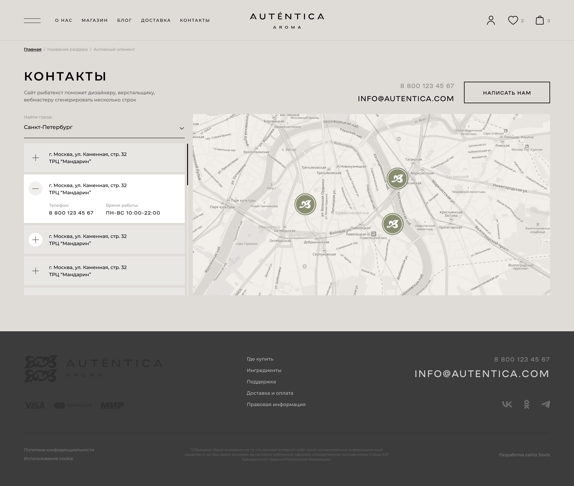
We did not have a goal to get into the search results for medium- and high-frequency queries in search engines: the products of the brand are «niche». But we strive to be higher in the output than the marketplaces and stores where the brand's products are presented. We made micro-markup, fixed errors according to the recommendations of Google and Yandex. Optimized the download speed. We took into account commercial factors: we made a page with the addresses of offline places of sale and a page «Delivery and payment».

We have connected the
payment system
Online payment is available to the buyer when placing an order. To do this, we use Tinkoff acquiring (T-Bank)

Gallery
Look at the design layouts of the site,
made for the project «Autentica-Aroma»
made for the project «Autentica-Aroma»

A few numbers
We always count, but we can't show all the numbers.
But some of us can do it a little bit!
But some of us can do it a little bit!
0,8 Seconds
Loading speed
of the site pages
of the site pages
6 Months
We spent time discussing the details and launching the first version of the site
59 Pieces
Page layouts were rendered while we were working on the design
Order a project
Contact us and we will share our experience and help with the implementation!
Write


See
similar cases
similar cases

Web-AR for Gauss
Made a small promotional site and a decision with augmented reality on Web-A for the company Varton
2022


VITRAJI
We have developed a website for the presentation of the company's products and the benefits of working with it for construction companies, designers and agencies.
2022

Amarylis
In 2019, the company restarted the online store, and, faced with the task of designing the interface and creating design, turned
to us for help.
to us for help.
2020


Noirot
Together with Nuaro LLC, our team did product photography for the catalog and advertising.
2019

Cut&Go
We put things in order in the marketing of a beauty salon
in Moscow. Beauty is such a beauty.
in Moscow. Beauty is such a beauty.
2018


Panam Pizza
We developed a set of promotional materials for the franchise of the Panama pizzeria network.
2022

Premium Technologies
We developed a promotional website and advertising campaigns to promote retail and small wholesale sales of Schüco products and additional services of Premium Technologies.
2021


ANO DPO RIPKiPMR
We created an online store of educational programs for medical workers and an advertising campaign at the federal level.
2018


Oscar-Et-Valentine
It happens that after the launch of the site, its redesign is immediately required. This is exactly what happened to the Oscar Et Valentine website.
2020
Show more


